Decoded #1
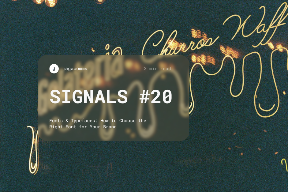
Fonts & Typefaces: How to Choose the Right Font for Your Brand
Fonts are more than design elements — they define how your brand communicates. From elegant book covers to minimalist websites, typography shapes perception long before words are read. Serif fonts convey tradition and authority; sans-serif fonts signal innovation and ease.
Choosing the right typeface is choosing the tone of your story.
Lesson: Typography isn’t cosmetic. It’s strategy in plain sight — the first layer of brand trust.
Decoded #2
Fix the Image Before the Message
People don’t think in facts — they think in images. Say “climate change” and you see a melting iceberg. Say “nuclear” and you see Chernobyl. Symbols define public understanding long before explanation does.
If your field is misunderstood, logic won’t save you; visual language will.
Lesson: The story people tell about you begins as a picture. Control the image and you shape the message.
On Our Radar
Tech Startup of the Week: MAD
A Berlin-based startup replacing polyurethane climbing holds with mycelium- and bioresin-based alternatives. MAD’s circular model allows gyms to rent, refurbish, and ultimately compost the holds — turning waste into soil instead of landfill. Backed by MotionLab Berlin’s hardtech accelerator, MAD is bringing circular design to sport manufacturing.
Lesson: Sustainability isn’t a slogan — it’s a system. Design that returns to the earth builds credibility that lasts.
Signals of Progress
How Designers Made Climate Science Shareable
When the IPCC’s climate reports proved unreadable to most, independent designers turned data into stories — clean charts, colour-coded maps, and carousels that made science human and urgent. The result: millions engaged with findings that once stayed on page 200.
Lesson: Clarity isn’t simplification. It’s translation — turning complexity into comprehension without losing truth.
{$te}
From fonts to fungi, this issue is about the same principle: design as communication. Typography builds identity. Imagery builds perception. Materials build meaning.
When each layer aligns — aesthetic, symbol, substance — audiences stop seeing “design” and start seeing direction.